Staring at a nautical chart for the first time can feel like trying to decipher an ancient map written in a language you don't speak. It's a flurry of symbols, numbers, and lines. But what if you could learn to read it fluently? Mastering how to read nautical charts boils down to understanding four critical pieces of information: the water's depth, the aids to navigation like buoys, any potential hazards like rocks or wrecks, and the shape of the shoreline itself.
Your First Look at a Nautical Chart
Even with a high-tech GPS chartplotter on the helm, the paper chart remains the bedrock of safe navigation. A GPS is brilliant at telling you where you are, but a chart tells you what's around you—especially what’s hidden beneath the water's surface. It provides the crucial context your electronics simply can't.
Think of it this way: your GPS is like your car's speedometer, giving you a precise location and speed. The chart is the detailed road map showing you the bridges, one-way streets, and potential roadblocks ahead. This guide will break down the chart's language into simple, practical concepts, covering both traditional paper charts and their modern digital cousins, Electronic Navigational Charts (ENCs). This is your first step toward becoming a truly confident mariner.
Why You Still Need to Master Charts
Knowing how to read a chart isn't just a "just in case" skill for when the power goes out; it's a fundamental part of good seamanship. This has been true for centuries. In fact, the push for accurate charting completely reshaped maritime trade and safety.
Back in 1816, the U.S. Office of Coast Survey, a predecessor to today's NOAA, began the monumental task of surveying the American coastline. By 1835, their meticulous work in New York Harbor didn't just identify submerged hazards—it revealed a brand-new deep-water channel. This discovery quickly became the main entrance for large vessels, proving how accurate charts directly fuel safety and commerce. You can learn more about these pioneering hydrographic surveys on NOAA's website.
A chart gives a mariner the power to see the unseen. It's the only way to truly understand the depths, dangers, and channels that will define your voyage before you even cast off the lines.
The best part is that this visual language is standardized across the globe, meaning a boater from Florida can interpret a chart for the Mediterranean just as easily as their home waters.
Essential Nautical Chart Elements at a Glance
This table provides a quick reference to the critical components found on every nautical chart, which we'll explore in detail throughout this guide. Getting comfortable with these will make the rest of the learning process feel much more intuitive.
| Component | What It Shows | Why It Is Critical for Navigation |
|---|---|---|
| Depth Soundings | The depth of the water at a specific location. | Prevents running aground by clearly marking shallow areas. |
| Navigation Aids | Buoys, lights, and beacons marking safe channels. | Guides your vessel along safe routes, especially at night or in poor visibility. |
| Hazards | Submerged rocks, wrecks, and other obstructions. | Helps you actively steer clear of dangers that could damage your boat. |
| Shoreline Features | The shape of the coast, piers, and landmarks. | Provides essential visual reference points to confirm your position. |
Each of these elements contributes a vital layer of information. As we unpack them one by one, you'll see how they work together to create a complete picture of the marine environment.
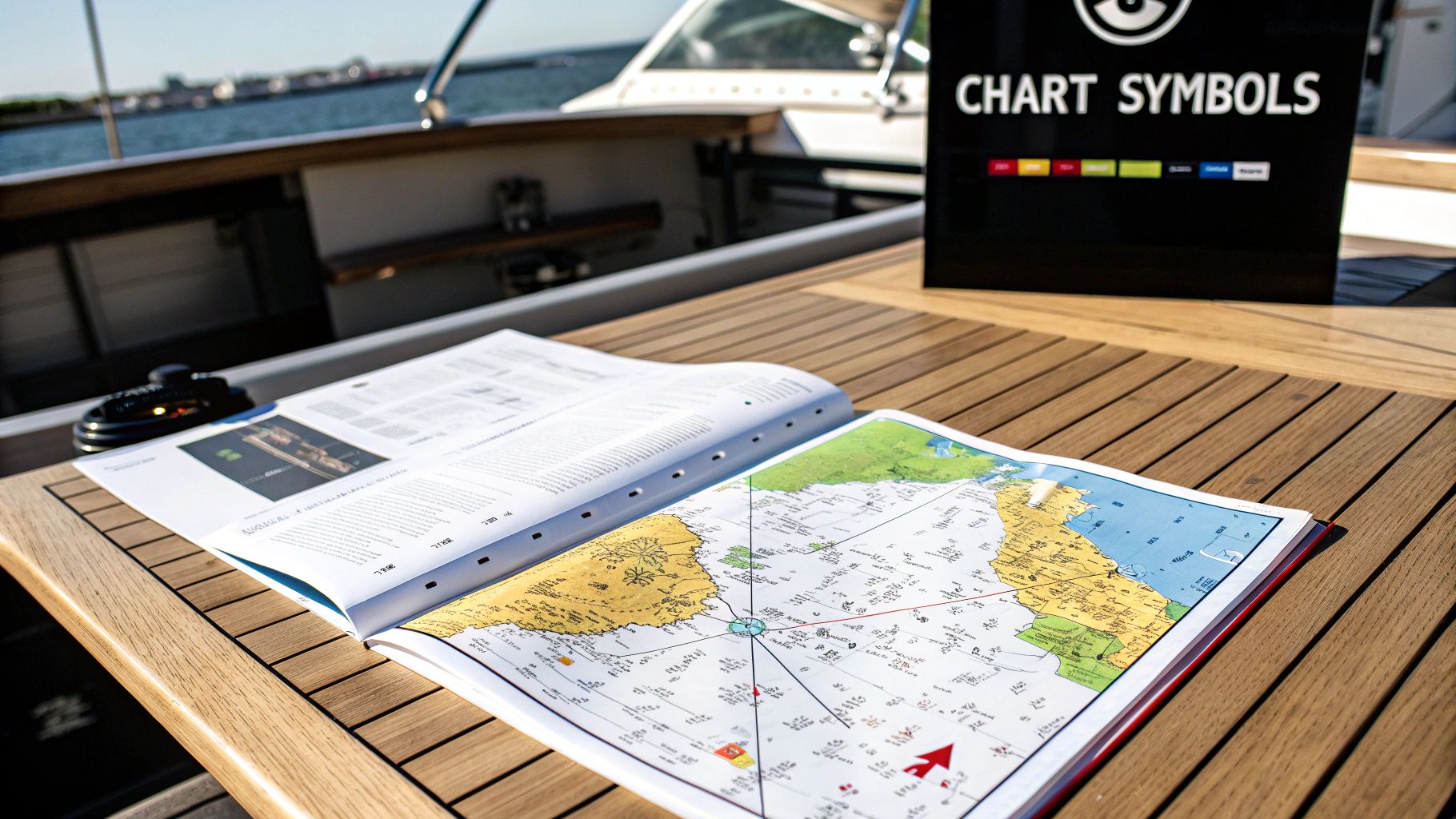
Decoding the Chart's Symbols and Colors
Think of a nautical chart as a conversation. It speaks a rich, visual language through its symbols, colors, and abbreviations. Learning how to read nautical charts is like becoming fluent in the language of the sea, transforming what looks like a complex map into a clear, reliable guide for safe passage.
You don't need to memorize every single symbol overnight. The real skill is knowing where to find the answers and how to quickly spot the most critical information. Your best friend in this process is a publication called U.S. Chart No. 1. It's the official dictionary, the complete legend for every symbol you'll find on NOAA charts. Keep a copy handy.
Understanding Aids to Navigation (ATONs)
The first symbols you'll get to know are the Aids to Navigation, or ATONs. These are the "road signs" of the waterway, marking safe channels, warning of dangers, and guiding you from point A to point B. They mainly come in two forms: buoys (which float) and beacons (which are fixed to the seabed).
On a chart, you'll see them as small diamonds or circles, often labeled with a color (like G for green or R for red) and a number.
When navigating in U.S. waters, the old mariner's saying is your gospel: "Red, Right, Returning." This simply means when you're heading back in from the sea—into a harbor or up a river—you keep the red, even-numbered buoys to your boat's right (starboard) side. Naturally, the green, odd-numbered buoys will be on your left.
Navigational aids aren't just suggestions; they are a system designed for predictability. Trusting and correctly interpreting this system is a core element of good seamanship and risk management on the water.
Interpreting Light Characteristics
When the sun goes down or fog rolls in, a chart really proves its worth. Next to any lighted buoy or lighthouse symbol, you'll find a shorthand code that describes its unique light pattern. This is crucial for confirming your position in the dark.
- Fl (4) Y 15s: This light flashes four times (Fl (4)), is yellow (Y), and the whole sequence repeats every 15 seconds.
- Q R: This indicates a quick-flashing (Q) red (R) light.
- Iso G 6s: This is an isophase (Iso) green (G) light, where the time it's lit is equal to the time it's dark, all repeating every 6 seconds.
Matching the blinking light you see on the horizon to its description on your chart is one of the most satisfying and reassuring feelings in boating. For a deeper dive, this guide to boat navigation signs is a great resource.
Identifying Hazards and Seabed Features
Beyond the friendly guidance of ATONs, your chart is also your early warning system for things you need to avoid. Being able to spot these hazards at a glance is a non-negotiable skill.
This image shows just how clearly a chart marks wrecks, rocks, and obstructions. Spotting these symbols is the first step in plotting a course that gives any underwater danger a very wide berth.
Here are a few common ones to burn into your memory:
- Wrecks: Marked with a specific symbol that might tell you if it's visible or if it's a dangerous submerged wreck.
- Rocks: Look for a plus sign (+) or an asterisk (*). An asterisk often means the rock is visible at low tide but underwater at high tide.
- Obstructions: Often abbreviated as "Obstn", this is a catch-all for other hazards that could ruin your day.
- Kelp or Seaweed: A plant-like symbol warns you of areas where you could easily foul your prop.
The colors on the chart give you a quick visual of the underwater landscape. White is the good stuff—deep, safe water. Light blue signals shoaling water where you need to be cautious. And darker blue indicates the shallowest spots, which might even be dry land at low tide. This color-coding gives you an instant feel for the bottom without having to read a single number.
Understanding Depths and Chart Scales
The numbers, colors, and scales on a nautical chart are what stand between you and a very bad day. Getting a feel for how these elements work together is the key to mastering how to read nautical charts. It’s how you turn a flat piece of paper into a three-dimensional map of the world beneath your keel. Let's get into what this vital information is telling you.
Those numbers scattered all over the blue and white parts of your chart are depth soundings. They show you the water's depth at a particular spot, but there’s a critical catch: it's not the actual depth at that very moment.
Every charted depth is measured from a specific low-tide average, what we call the chart datum. In the U.S., this is almost always Mean Lower Low Water (MLLW), the average of the lower of the two low tides each day. You'll find a note on your chart, usually in magenta, telling you if the depths are in feet, fathoms, or meters.
Key Takeaway: The depth on the chart is a conservative baseline, not the real-time water level. To get the actual depth, you must add the current tide height to the number on the chart. Never assume that number is what's under your boat right now.
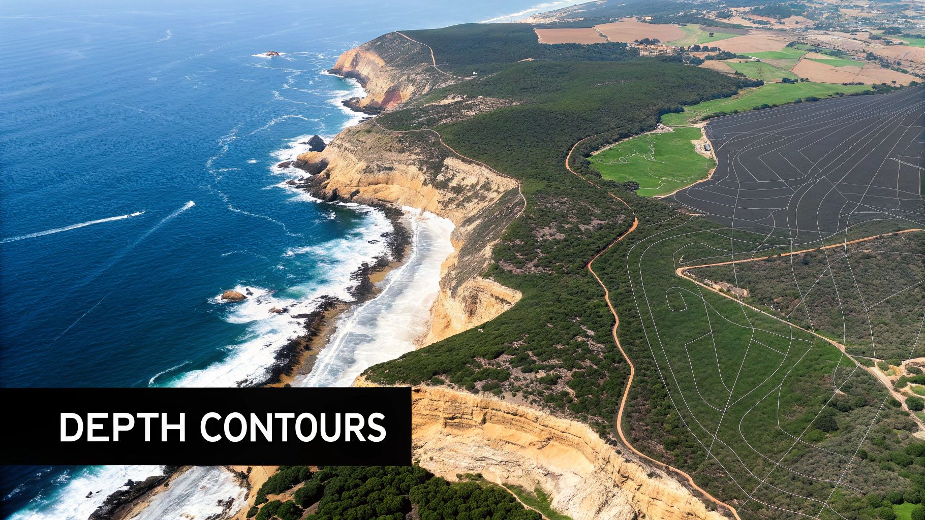
Visualizing the Seabed with Contour Lines
Connecting those individual depth soundings are the depth contour lines. The concept is identical to topographic lines on a hiking map, just for the seabed. Every point along a single line has the same depth.
If you see contour lines spaced far apart, you’re looking at a gentle, gradual slope. But when they’re packed tightly together, that’s a warning sign for a steep drop-off or an underwater bank. Following a contour line is a fantastic navigation technique, allowing you to parallel the coast while staying in a safe, predictable depth.
Making Sense of Chart Scale
Every chart has a scale—the ratio of a distance on the chart to the actual distance over water. You'll find it printed in the title block, and it tells you exactly how much detail you're getting.
- Large-Scale Charts: With a scale like 1:20,000, these show a small area in great detail. They are non-negotiable for harbor approaches and navigating tight channels where every rock and buoy matters.
- Small-Scale Charts: Covering huge areas with less detail (e.g., 1:1,000,000), these are your go-to for planning long offshore passages.
Picking the right scale for the job is crucial. Trying to enter a tricky harbor using a small-scale coastal chart is asking for trouble because it simply won’t show the hidden dangers or detailed buoyage you need to see.
This whole system of laying our spherical world onto a flat chart relies on the Mercator projection. The real breakthrough came in 1599 when Edward Wright figured out the math to make a constant compass bearing plot as a straight line—a feature that remains fundamental to marine navigation today. You can read more about the fascinating evolution of navigation and how these principles came to be.
A Practical Tip for Measuring Distance
So, how do you actually measure how far it is from point A to point B on your chart? You can't use the longitude scale at the top and bottom; the Mercator projection stretches it out. Instead, you always use the latitude scale running down the left and right sides.
Here's the one rule you need to burn into your memory:
One minute of latitude equals one nautical mile.
To measure a leg of your trip, grab your dividers. Set one point on your start and the other on your destination. Without changing the spread, bring the dividers over to the latitude scale on the side. The number of minutes your dividers cover is your distance in nautical miles. It's a simple, essential skill you'll use constantly.
Using the Compass Rose for Real-World Navigation
The compass rose is the beating heart of your chart. It's the critical piece that turns the flat paper in front of you into actionable directions on the water. More than just a pretty symbol, it's the essential link between the map and your ship's compass, allowing you to convert a simple line between two points into a precise course to steer.
Think of it as the chart’s own built-in translator. This powerful tool is made of two concentric circles. The outer circle, often marked with a star, always points to True North—the geographic North Pole. The inner circle, however, points to Magnetic North, which is where your boat's compass needle is actually pointing. And those two directions are rarely the same.
Finding and Applying Magnetic Variation
That angular difference between True North and Magnetic North is called variation. It exists because the Earth's magnetic field doesn't line up perfectly with its rotational axis, and it changes depending on where you are in the world.
To find the correct variation for your location, just look at the center of the nearest compass rose on your chart. You'll see the variation listed in degrees, specifying whether it is East (E) or West (W), along with the year it was measured. It will also give you the annual rate of change, so you can calculate the current variation for today.
For instance, the note might say: Var 14°45'W (2015) annual increase 8'. If you're using this chart in 2025, ten years have passed. The total increase is 80 minutes (8' x 10 years), which is the same as 1 degree and 20 minutes. The new, updated variation would be 16°05'W.
A classic memory aid for converting courses is the phrase: "East is Least, West is Best." When going from a True course to a Magnetic one, you subtract an easterly variation and add a westerly one. It works every time.
From a Plotted Line to a Steerable Course
So, let's put this into practice. Once you’ve drawn a course line on your chart—say, from the harbor entrance to a nearby island—you need to figure out its bearing. This is where your parallel rulers become your best friend.
Lay one edge of your parallel rulers perfectly along the course line you drew. Then, carefully "walk" the rulers across the chart, making sure to keep the angle precise, until the edge passes directly through the small cross at the very center of the compass rose. Where the ruler's edge crosses the outer (True) ring, you have your true course. Let's imagine it reads 110° True.
But you can't steer a True course—your compass reads Magnetic. Using our example variation of 16°W, we apply our memory aid ("West is Best," so we add):
- True Course: 110°
- Variation: +16° W
- Magnetic Course: 126°
Your helmsman or autopilot should now be set to steer 126° Magnetic to follow the course you plotted. This conversion is a fundamental skill and is covered well in this helpful boat navigation guide for beginners.
A Practical Scenario Between Two Islands
Let’s try a real-world example. You're planning a trip from Catalina Harbor to Avalon on Santa Catalina Island. After drawing a line that keeps you well clear of any charted hazards, you walk this line over to the compass rose with your rulers. The line reads 095° True.
Now, you look at the center of the compass rose and find the local variation is 12° East.
It's time for the conversion:
- Start with your True course: 095°
- Apply the variation: "East is Least," so you need to subtract.
- Calculation: 095° – 12° = 083°
The magnetic course you need to steer is 083°. This simple process is what transforms abstract lines and numbers into a concrete, safe, and reliable instruction for your journey. It's the moment the chart truly comes to life.
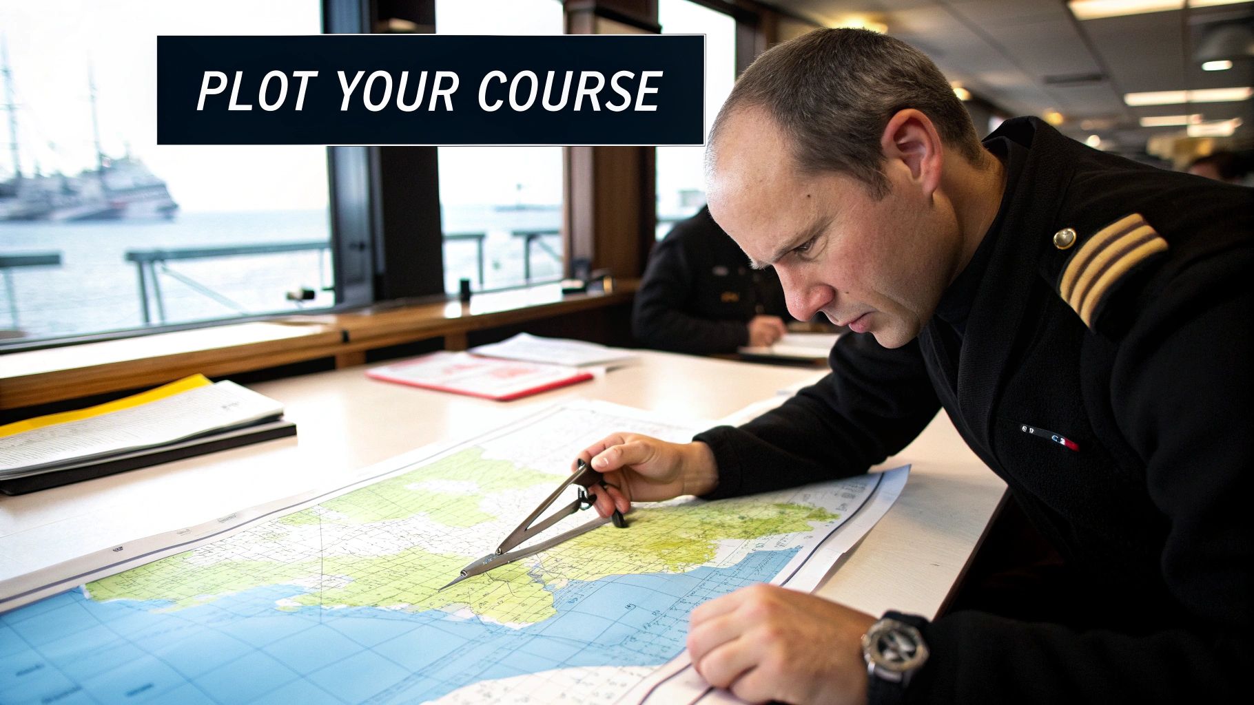
Plotting Your Course from Point A to B
Alright, this is where the rubber meets the road—or rather, where your pencil meets the paper. We've covered the what, now let's get into the how. This is the hands-on skill of actually plotting a safe course, turning all those symbols and numbers into a reliable plan to get you from A to B. For this classic exercise, you'll need your trusty dividers and parallel rulers.
The first order of business is picking smart waypoints. These aren't just random dots on the chart. They are carefully selected positions that create a safe "connect-the-dots" path around known hazards like shoals, submerged wrecks, or other nasty surprises. You're essentially building a route out of several straight-line segments, or "legs," that keep you in safe water.
Drawing and Measuring Your Course
Once you have your starting point, your destination, and any waypoints in between, grab a sharp pencil. Using your parallel rulers, draw a light, clean line for each leg of your trip. Now, look closely at that line. Does it cut across a light blue area, signaling shallow water? Does it skim a little too close to that rocky outcrop? If so, adjust it. Don't be afraid to add another waypoint to give a hazard a wider berth.
With your course drawn, it’s time to figure out the distance. This is where your dividers come into play.
- Place one point of the dividers at the beginning of a leg.
- Open the other point until it rests exactly at the end of that same leg.
- Without changing the spread, carefully lift the dividers and walk them over to the latitude scale on the side of the chart.
- Align the points with the scale to read the distance. And remember the golden rule: one minute of latitude is one nautical mile.
Add up the distances for each leg, and you’ll have your total trip distance. Once you've mapped out the journey, you also need a solid plan for when you arrive. Knowing how to secure your boat is critical, so it's worth brushing up on how to anchor a boat before you cast off.
Dead reckoning is the art of knowing where you are by knowing where you've been. It combines your last known position with your course, speed, and the time you've traveled. Even with GPS, it's a vital backup skill.
Introducing Dead Reckoning
This brings us to dead reckoning, one of the most fundamental skills in navigation. It’s all about estimating your current position by using three key pieces of information: your last confirmed location, the course you've been steering, and your speed over a certain amount of time.
This simple infographic breaks down how to identify aids to navigation, which is a huge part of confirming your position when you're out on the water.
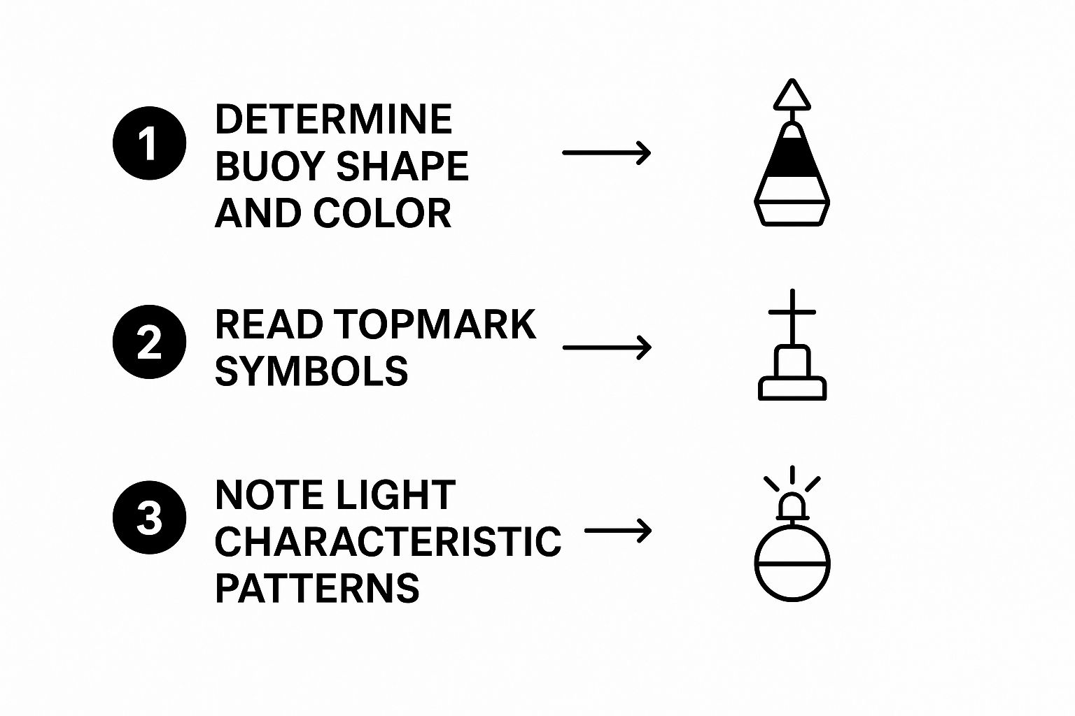
As you can see, the process of noting a buoy's shape, color, topmark, and light characteristics is how you match what you're seeing with what's on the chart. It's your real-world fact-check.
For centuries, this is how mariners found their way. Before we had fancy electronics, sailors used tools like leadlines—literally a lead weight on a marked rope—to check the depth. For speed, they used a "chip log," a piece of wood on a knotted line tossed overboard. They'd count how many knots paid out over a set time, and that's where we get the term "knots" for speed. It’s always been about combining these inputs—depth, speed, and position—to navigate safely.
Practicing course plotting and dead reckoning is what truly cements these skills. It's how you build the confidence to not just read a chart, but to use it as a living, breathing tool for planning and executing your own adventures.
Common Questions About Reading Nautical Charts
As you put your newfound knowledge to the test on the water, you're going to have questions. It’s a natural part of the process. Even the most seasoned sailors will pause to double-check a symbol or confirm an interpretation. This section is here to tackle some of the most common sticking points that come up when you really start digging into how to read nautical charts.
Let's think of this as your troubleshooting guide. We'll go through the issues that tend to trip up new navigators, giving you clear answers that will help you build real confidence at the helm.
How Do I Account for Tides and Currents on a Chart?
This is probably the most critical question you can ask, because a charted depth is just a static number on a very dynamic ocean. Those depths you see printed on the chart are based on a low-tide average, a baseline known as chart datum. To figure out the actual depth under your keel at any given moment, you absolutely must consult a current tide table for your specific area.
You simply take the current tide height from the table and add it to the number on your chart. This calculation isn't optional—it's what keeps you from running aground.
When it comes to currents, you'll need to look at Tidal Current Tables or find specific notes printed directly on the chart itself. These resources give you two key pieces of information: the current's direction (set) and its speed (drift). When you're plotting a course, you have to factor in how that current will be pushing you sideways, which affects your actual track over the ground.
What’s the Difference Between a Raster and a Vector Chart?
Once you start using electronic navigation tools, you'll run into two main kinds of digital charts. Knowing the difference is key to getting the most out of your chartplotter.
A Raster Chart (RNC) is basically a high-resolution digital picture of a paper chart. Think of it as a fancy PDF. When you zoom in, the symbols, numbers, and lines just get bigger until they start to look blurry or pixelated.
A Vector Chart (ENC), however, is a "smart" chart. It's built from a database of individual objects—buoys, soundings, lights, and so on. As you zoom in on an ENC, more details can pop up, like smaller depth soundings or extra nav aids. You can also tap on a symbol, like a buoy, to get a pop-up window with all of its specific information.
Because they are data-rich and interactive, Vector Charts (ENCs) are the global standard for modern commercial Electronic Chart Display and Information Systems (ECDIS). For recreational boaters, they offer a far more powerful and detailed view of the marine environment.
Why Doesn't My Compass Match the Plotted Course?
Ah, the classic navigation headache! This almost always boils down to two different magnetic forces you have to account for.
The first is variation, which we've already touched on. It's the regional difference between true north (on the chart) and magnetic north (where your compass points). You correct for this using the information found on the chart's compass rose.
The second, and more often forgotten, problem is deviation. This is magnetic interference created by your own boat. Things like your engine, stereo speakers, VHF radio, and even big metal fittings create a unique magnetic field that throws your compass off. This error is completely specific to your vessel.
To fix this, you need a deviation card, which you create by "swinging the compass"—a process of checking the compass reading against known headings. The complete formula to get from the course on your chart to the course you actually steer looks like this:
- Start with your True Course (from the chart).
- Apply Variation (from the compass rose) to get your…
- Magnetic Course.
- Then, apply Deviation (from your boat's deviation card) to get your…
- Compass Course (this is the number you steer to at the helm).
Forgetting that last step for deviation is one of the top reasons new navigators find themselves way off course, even when they thought their chart work was perfect.
How Often Should I Update My Charts?
Navigating with an outdated chart is just plain dangerous. The marine environment is always changing—sandbars shift, channels are dredged, buoys get moved or their lights go out, and new wrecks or obstructions appear all the time.
To keep mariners informed, the U.S. Coast Guard and NOAA issue weekly updates called Notice to Mariners. These publications list every single recent change to charts and navigation aids.
- Paper Charts: If you're a traditionalist using paper charts, it's your personal responsibility to apply these corrections by hand with a pen. It can be tedious, but it’s a critical task.
- Electronic Charts (ENCs): Here's where digital shines. With ENCs, updates can often be downloaded and applied automatically or with just a few clicks, which is a massive safety advantage.
As a non-negotiable rule of thumb, you should never navigate in coastal waters with a chart that's more than a year old unless you have confirmed that every single published update has been applied. For commercial vessels, this isn't just a good idea; it's a legal requirement. Keeping your charts current is a fundamental part of responsible seamanship.
At Boating Articles, we are dedicated to helping you become a more confident and capable mariner. Our extensive library of guides covers everything from advanced navigation techniques to DIY maintenance projects, empowering you with the knowledge to enjoy your time on the water safely. Explore more expert advice at https://boating-articles.com.